You’ve Been Asking, Here’s My Answer – My preferred Presets
Probably the age-old question right before or after asking a photographer’s settings 😉
I get asked this a lot and I am diving in to give you my long answer!
Editing is one of the most important aspects of photography, as it is where your photos really come to life (especially if you shoot in raw!). The most common editing software for professional photographers is Adobe Lightroom and Photoshop (sign up to Adobe Creative Cloud here!).
What is a RAW image? RAW is a file format that captures all image data recorded by the sensor when you take a photo. Basically, it’s not compressed like a jpeg is, so no data is lost. This gives the highest quality files. This is super helpful when editing your photos in post production, as you can manipulate the information in these pixels.
BUT FIRST- Let me draw the line here. There isn’t a true comparison with someone using their mobile phone with a preset on Lightroom mobile, versus a professional photographer and their equipment and software to process a professional final edited image.
LET’S BACK UP!- What exactly is a preset?
Lightroom presets are image filters that use a set of pre-saved settings to edit your photos to look brighter, richer and add depth, thus making it more appealing to interpret. You can be a novice and know a very simple approach to this all the way to a professional with an understanding on how to manipulate the aspects of the information in the pixels with the various sliders and curve/tone functions to create an enriching piece of art.
That 1 click approach you hear about is not generally the norm and works best, using Lightroom Mobile if you are a beginner just looking for some kind of consistency on your instagram grid. As you grow in your time as a photographer/editor so does your eye and you begin to see skin tone, depth etc even more clearly with your vision, therefore, acquiring additional understanding to your editing workflow.
When you truly approach your profession as a Camera Artist, there are several layers to the editing process. A gallery of 40-60 images can take anywhere between 5-10 hours to complete.
One huge benefit of Lightroom Presets is the ability to create a consistent style for your photos – by buying presets from your favorite creators, or creating your own, you can start with a great base for a consistent aesthetic you are drawn to.
I have used Adobe Lightroom for Desktop for over 10 years, and have not approached creating my own presets and focused more on the approach of teaching the Lightroom functionality thus when using a preset – gaining the most benefits by understanding how to customize the preset to meet your vision. All too often presets are not the “1 click” you were hoping for and don’t reveal the same look and feel as the product sold to you- because presets can very well only fit a certain camera color profile, landscape and camera settings, leaving you baffled on how to now “fix it” based on your unique camera/location and settings.
I have 3 go to preset packs that have defined my branded look (depending on the time of day and location/settings) – so as they may work very well for me- it doesn’t mean they are 1 click. I work to adjust many aspects of the information to fit the mood and color profile – however, they do give me a great jump start 😉
https://triciavictoriaphotography.com/shop-presets
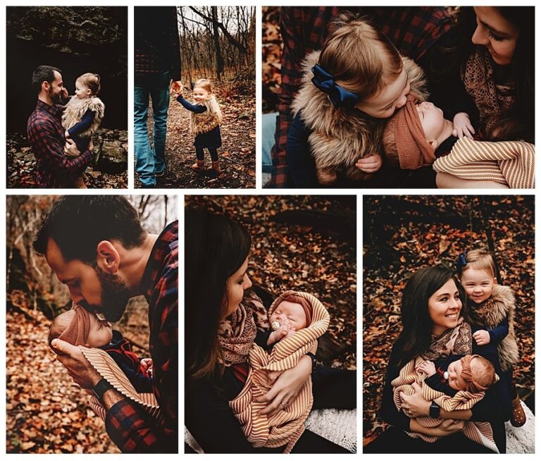
- Below is TVP Presets on direct lighting, Grain is heavy on this packs and whites are bit more crushed

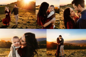
- This is SMAL VOL 2-01 (Sven Malojlo) Grain is moderate on these packs and color is desaturated

- Stormy has several packs offered depending on the season and year 1 or 2 of our amazing online course material
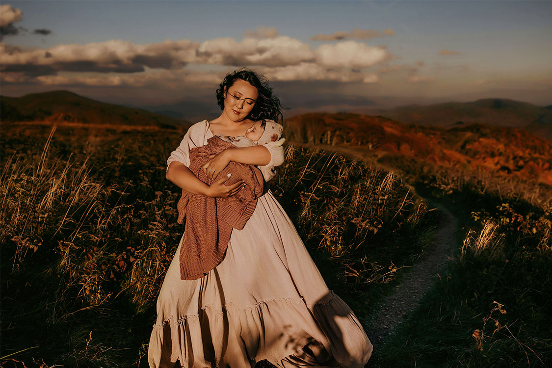
- I do like her Wistful Pack based on my landscape and ideal lighting preferences shot in camera
Lets dive a bit deeper into some useful tips around editing :
Color Theory
Color theory is an editing process that combines specific colors in a way that complement each other. A color wheel is a great way to help you determine which colors look good together.
For example, a deep plum and sage green are complementary colors, and always work well together for me in the Blue Ridge mountains in the Spring to Summer Seasons. Sage and Rust also work well together, so considering a Saturated burnt orange dress amongst a green Pine forest gives this same warm to cool ratio adding natural contrast in the imagery.
TheLightroom Panel
My editing style consists of a blend between direct lighting against a depth-ful landscape and back lighting with a touch of hazy, I also consider color saturation, rich contrast and warmth so I am generally picking between Tricia Victoria and SMAL based on the season and what colors are offered up in the landscape and styling of my subject.
- Exposure – I adjust the exposure to brighten the image a bit as I typically shoot underexposed to retain all information in my pixels therefore having full control with the information during the editing process.
- Highlights – I always tend to bring down my highlights, I will adjust this in my curves panel as well.
- Shadows – I tend to lift shadows slightly
- Clarity – I like to bring my ‘clarity’ slider up to add more texture
I do most of my work in the tone curve panel where I will adjust the shadows, mid tones and highlights. Mostly, I will bring up the blacks (shadows) a little, and pull down the highlights. If the image is too bright, I will pull the mid-tones down slightly.

Tonal Editing
I move on to white balance to fit the landscape and lighting conditions.
My next approach is in the HSL (hue, saturation, luminance) panel. This is where you can specifically approach each color in the image.
Sticking with primary/complementary colors keeps the process true to life and simple. Where I am mostly focused is on the skin tone (orange and red) and my sky (blue and turquoise). I am making minor desaturating or hue changes with orange. I am making more saturated and hue changes with blue and also lowering luminance with blue as well.
On to the Color Grading panel (formerly Split Tone), you can make highlight, mid or shadow tone adjustments here. To me, I feel this is where you are truly branding your style as this is a big part of where my consistency shines through – no matter the preset I stick to a more crushed highlight and richer, darker shadows. I try to position my subject in the lighting to get the contrast where I like it in camera already.
SELECTIVE EDITS
This can be somewhat the TIME BANDIT- you are surgically combing through an image at this point looking for various skin imperfections or sun spots and removing them along with adding gradient or radial filters to create more haze, pop of lighting with exposure and clarity or using the brush tool to make additional selective edits with blacks and whites.
Basically, it allows you to target a specific area with adjustments without affecting the rest of the image, and it’s a super powerful tool to take your photos to the next level. Selective edits can hugely transform your image, it is definitely where the unique artistry comes to life by digitally painting the image.
Your intent here can vary- Mine is more so to highlight the affection and interaction within the image by drawing the eye in closer in those moments. I am also ensuring the blacks are as depthful as I like them to be in certain pockets of interaction or landscape.
FINAL ADJUSTMENTS AND UPDATES
My next part of workflow is exporting images out of light room and importing into Photoshop for additional final edits to skin and overall image. This is also the place where I remove people or objects that are unwanted in the image.
I add additional sharpening to areas and overall smoothing as well for a creamier look. Finally, I do add grain back into my images ensuring it is removed from the skin.
Below are some generic settings you can refer to when exporting your images for the platform you intend to post them and deliver the work to your client:
Here are our generic settings:
- Instagram | 1080 pixels, resized to fit the short edge. Quality: 100, Resolution: 72, Sharpen: For screen
- Blog Landscape | 1800 pixels, resized to fit the long edge. Limit File size: 400kb, Resolution: 72, Sharpen: For screen
- Blog Vertical | 1080 pixels, resized to fit the short edge. Limit File size: 300kb, Resolution: 72, Sharpen: For screen
- Client work | No resizing. Resolution: 300
What a process right? I definitely get excited uploading my images after a session and starting the creative side of the workflow! It does take lots of time to find the joy in this process – so don’t be discouraged if you are feeling overwhelmed at first. These programs are very very robust with tons of pathway options to get to your final outcome.
If you are looking for more information or need a 1:1 experience with editing, check out my zoom mentorship where we can work together to create your style and preset.
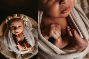
If you are looking for photographers in Asheville NC, I would be honored to share my experience with you. I am resident Family, Maternity and Newborn photographer. I offer a complete wardrobe of over 100 dresses including, newborn through Toddler sizes that you will have access to for your photography session. Check out the full Asheville Photography Experience along with the Investment Guide!
Are you ready to fine tune your style in photography and learn how to grow your business without pouring additional time into the process? Let me show you how to utilize key strategies in your technique and where to position your Brand to gain the ideal client for your specific niche! Check out my mentorship packages HERE. I am looking forward to supporting your career goals and your work/life balance!